Pastel colors have gotten a bad rap. Mention “pastel decor” and many people immediately picture nurseries, Easter baskets, or overly sweet spaces that feel more suited for a dollhouse than a grown-up home. But here’s the truth: when done right, pastels can create sophisticated, calming, and incredibly stylish interiors that feel fresh and modern.
The secret? It’s all about balance, context, and knowing which design principles to follow. Let’s dive into how you can embrace these soft, dreamy hues without your space looking like a candy shop.

Choose the Right Pastel Shades
Not all pastels are created equal. The key to mature pastel decor starts with selecting more complex, muted versions rather than bright, saturated tones.
Opt for these sophisticated options:
- Dusty rose instead of bubblegum pink
- Sage green rather than mint
- Powder blue over baby blue
- Warm blush tones instead of cotton candy pink
- Muted lavender rather than bright purple pastels
These toned-down versions have gray or beige undertones that automatically add sophistication. They’re the difference between “nursery” and “Parisian apartment.”

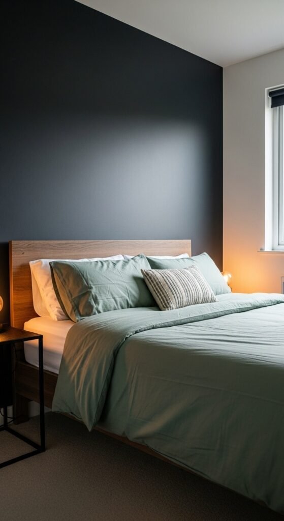
Ground Pastels with Darker Elements
This is perhaps the most important rule: never go full pastel. The fastest way to make pastels look childish is to use them everywhere without contrast.
Balance soft colors with:
- Charcoal gray or black accents
- Rich wood tones in walnut or oak
- Deep navy or forest green
- Matte black hardware and fixtures
- Dark-framed artwork or mirrors
Think of pastels as your supporting actors, not the lead. A dusty pink armchair looks sophisticated against a charcoal wall. That same chair in an all-pink room? Not so much.
Embrace Quality Materials and Textures
Texture is your secret weapon for elevating pastels from sweet to chic. The materials you choose can completely transform how a color is perceived.
Sophisticated texture choices:
- Velvet upholstery in pastel tones adds instant luxury
- Linen curtains or bedding in soft hues feel organic and refined
- Matte finishes over glossy (which can read juvenile)
- Natural materials like marble, stone, or concrete paired with pastels
- Bouclé fabric for a modern, tactile element
A pastel pink velvet sofa with brass legs reads completely different than a pastel pink polyester couch. Quality matters.
Use Pastels as Accents, Not Anchors
Strategic placement is everything. Instead of painting entire rooms in pastel shades, use them thoughtfully as accent colors.
Smart ways to incorporate pastels:
- A single accent chair in blush or powder blue
- Throw pillows and blankets layered on neutral furniture
- Artwork featuring pastel tones mixed with bolder colors
- A pastel-colored vase or sculptural object
- One accent wall in a muted pastel, with the rest in neutral tones
This approach lets you enjoy the softness of pastels while maintaining a grounded, adult aesthetic.

Pair with Modern Design Elements
Contemporary design elements automatically counterbalance any potential sweetness from pastel colors.
Modern touches that work beautifully:
- Clean-lined furniture with geometric shapes
- Abstract or minimalist artwork
- Metal accents in brass, copper, or matte black
- Statement lighting with sculptural designs
- Minimal window treatments or sleek Roman shades
The juxtaposition between soft colors and sharp, modern lines creates visual tension that feels intentional and sophisticated.
Skip the Theme, Focus on Cohesion
Perhaps the biggest mistake? Creating an overly coordinated “theme” with pastels. Matching everything in the same pastel family screams amateur.
Instead, mix your pastels with other color families. Combine sage green with terracotta and cream. Pair dusty rose with rust and charcoal. Let lavender mingle with warm browns and soft whites. This creates depth and prevents that one-note, childish feel.

Your Pastel Decor Takeaway
Decorating with pastels as an adult is absolutely possible—and can result in some of the most beautiful, serene spaces you’ll ever create. The trick is treating these soft hues with the same design principles you’d apply to any sophisticated color scheme: balance, quality, and restraint.
Remember: ground them with darker elements, choose muted shades over bright ones, invest in quality materials, and resist the urge to coordinate everything. When you approach pastels with intention rather than abandoning yourself to sweetness, you’ll create spaces that feel grown-up, calming, and undeniably stylish.
Ready to try pastels in your home? Start small with one accent piece and build from there. Save this guide for later when you’re ready to make your move!